Chapter
Giving character to the agency that picks everyone else’s gear.

- Client
- Chapter
- Industry
- Outdoor equipment sales agency
- Deliverables
- Brand strategy
- Brand identity
- Type design
- Visual system
- Stationery
- Out-of-home
- Packaging
- Promotional items
Chapter is an outdoor equipment sales agency. It manufactures nothing: it picks, for retailers here, the gear worth selling. A middleman position — and that is exactly what had to be made desirable.
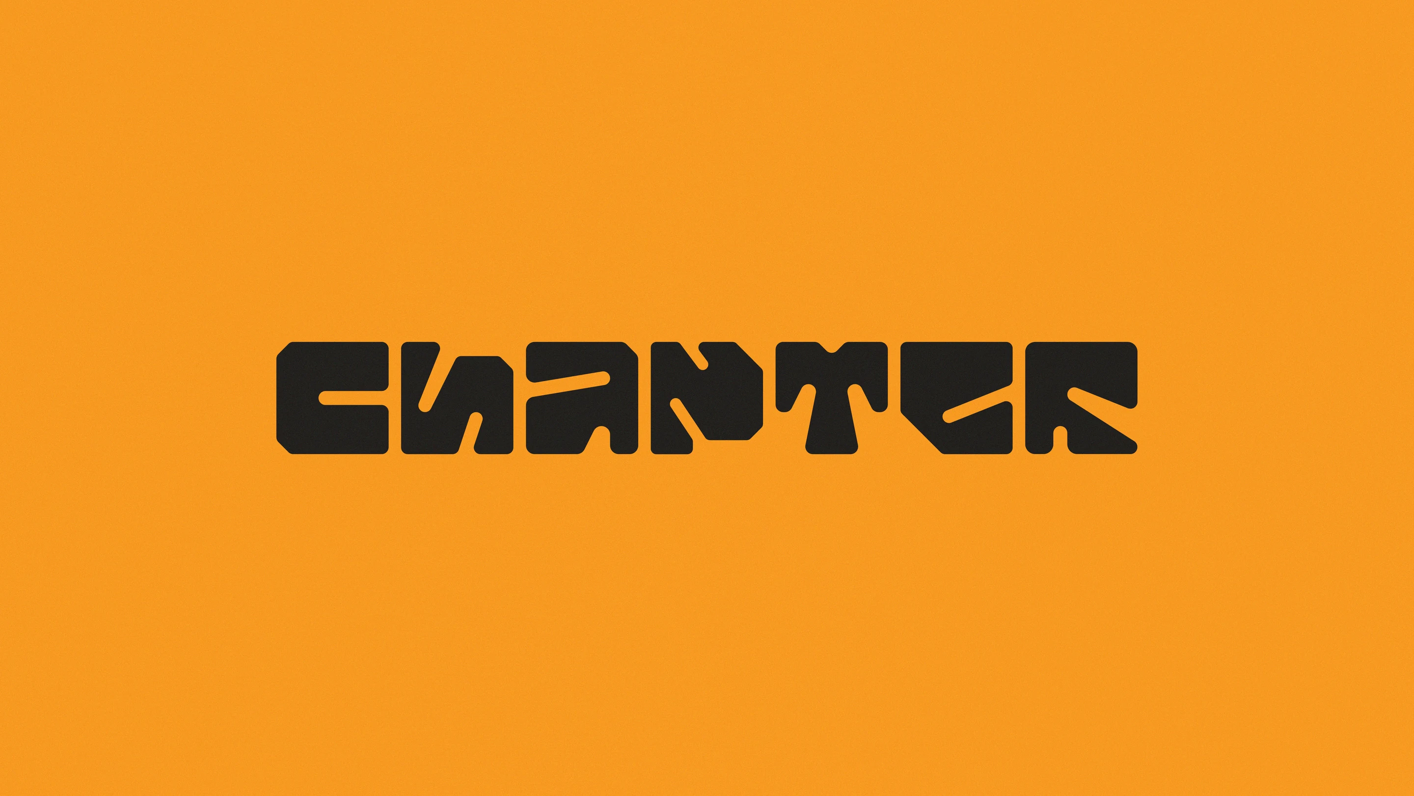
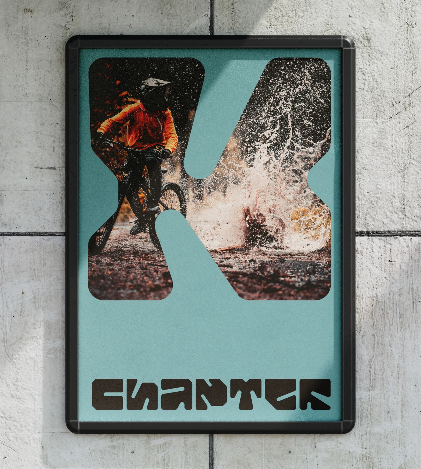
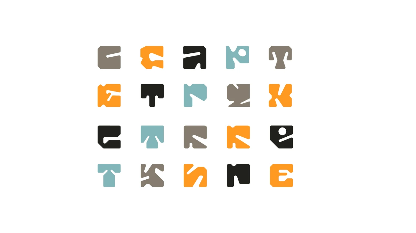
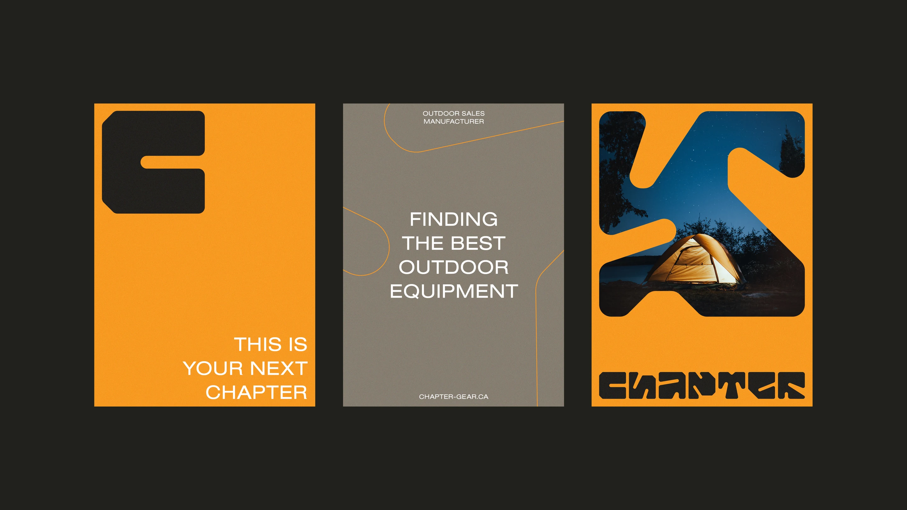
The name set the direction: the next chapter, the next trip out. The typographic system was drawn letter by letter — carved, almost cut-out forms that behave as much like a pattern as like a logotype. The counters become windows, and the outdoors comes through them.
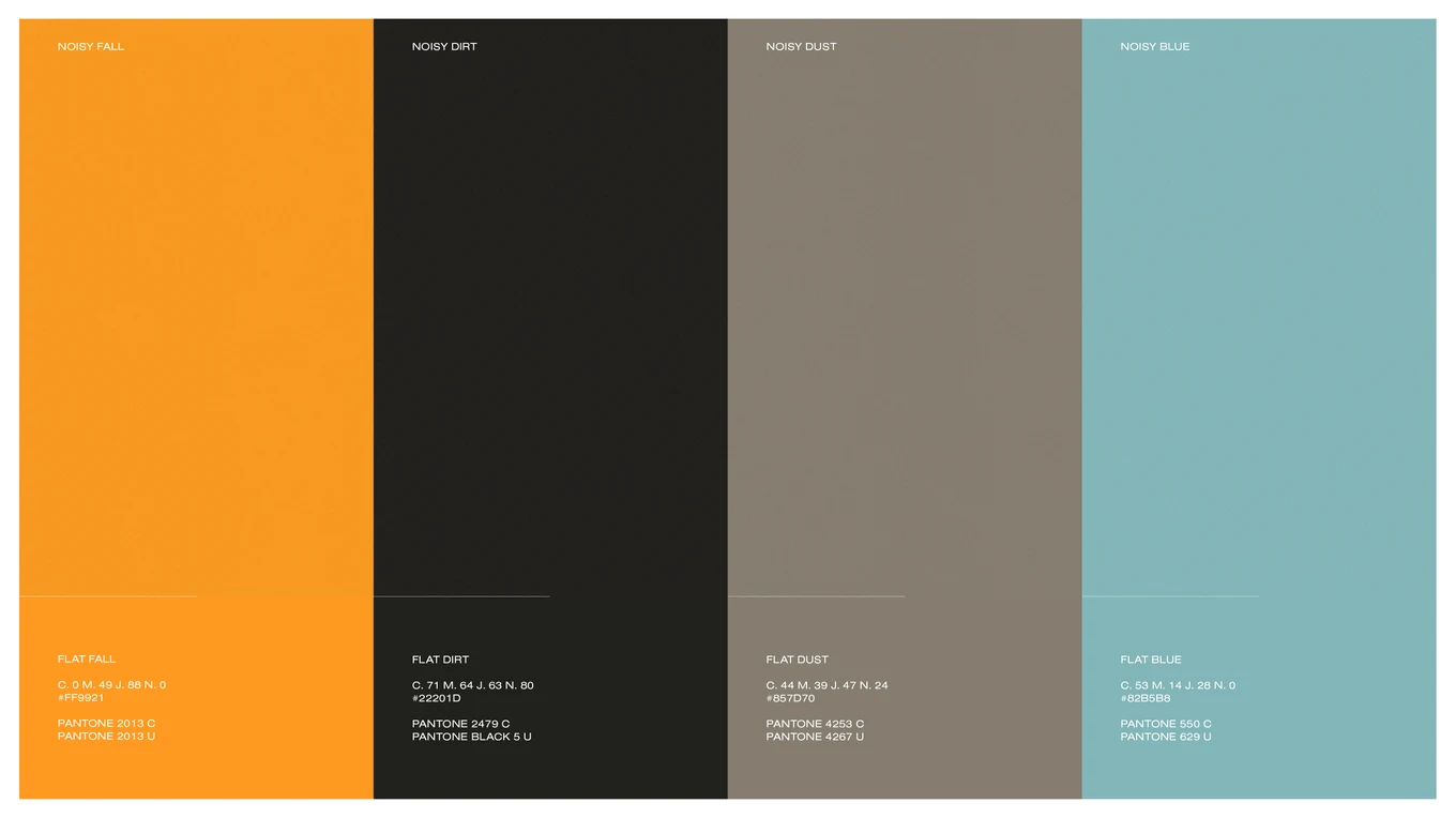
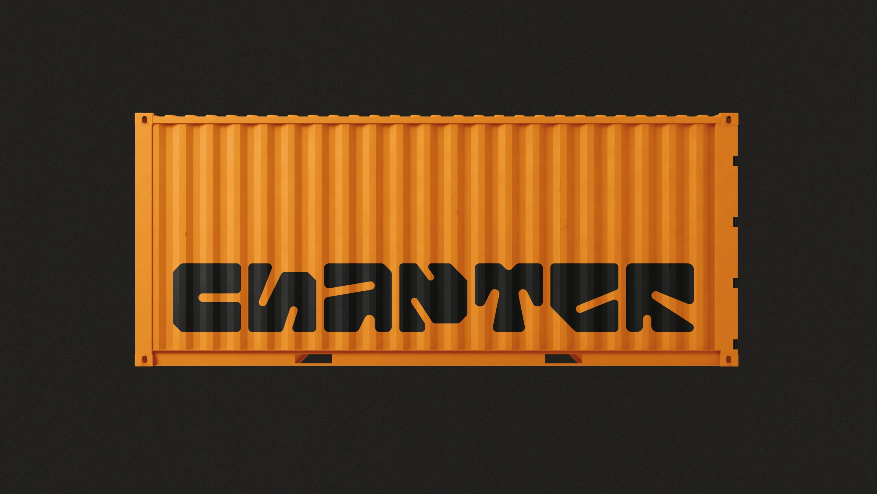
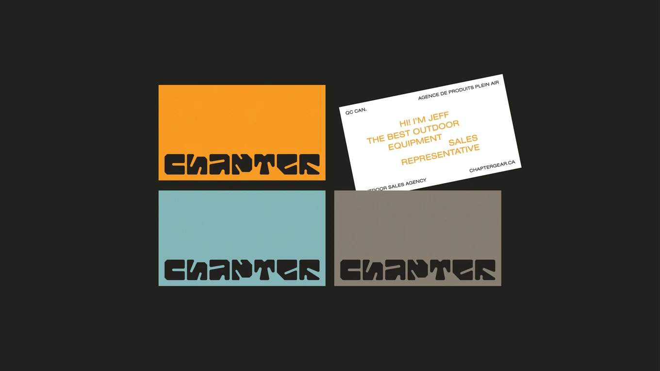
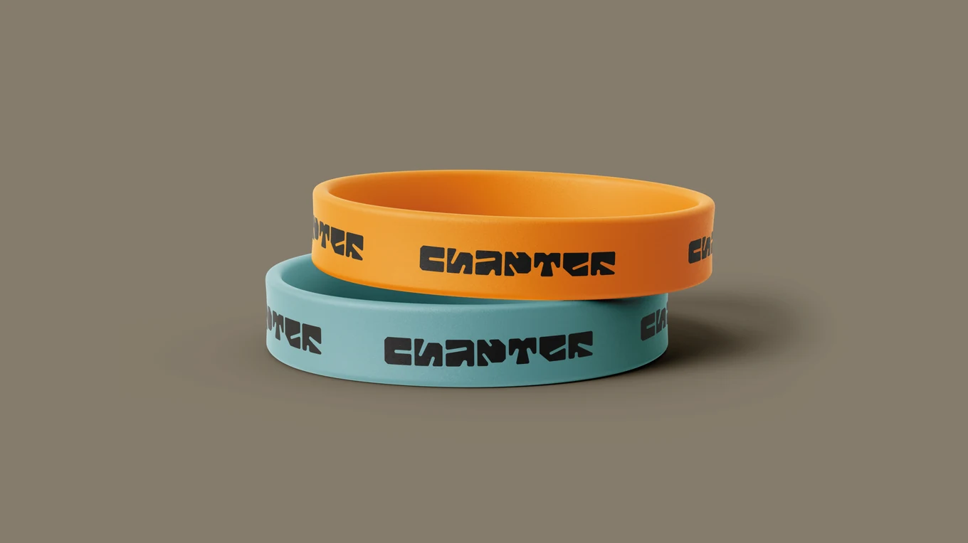
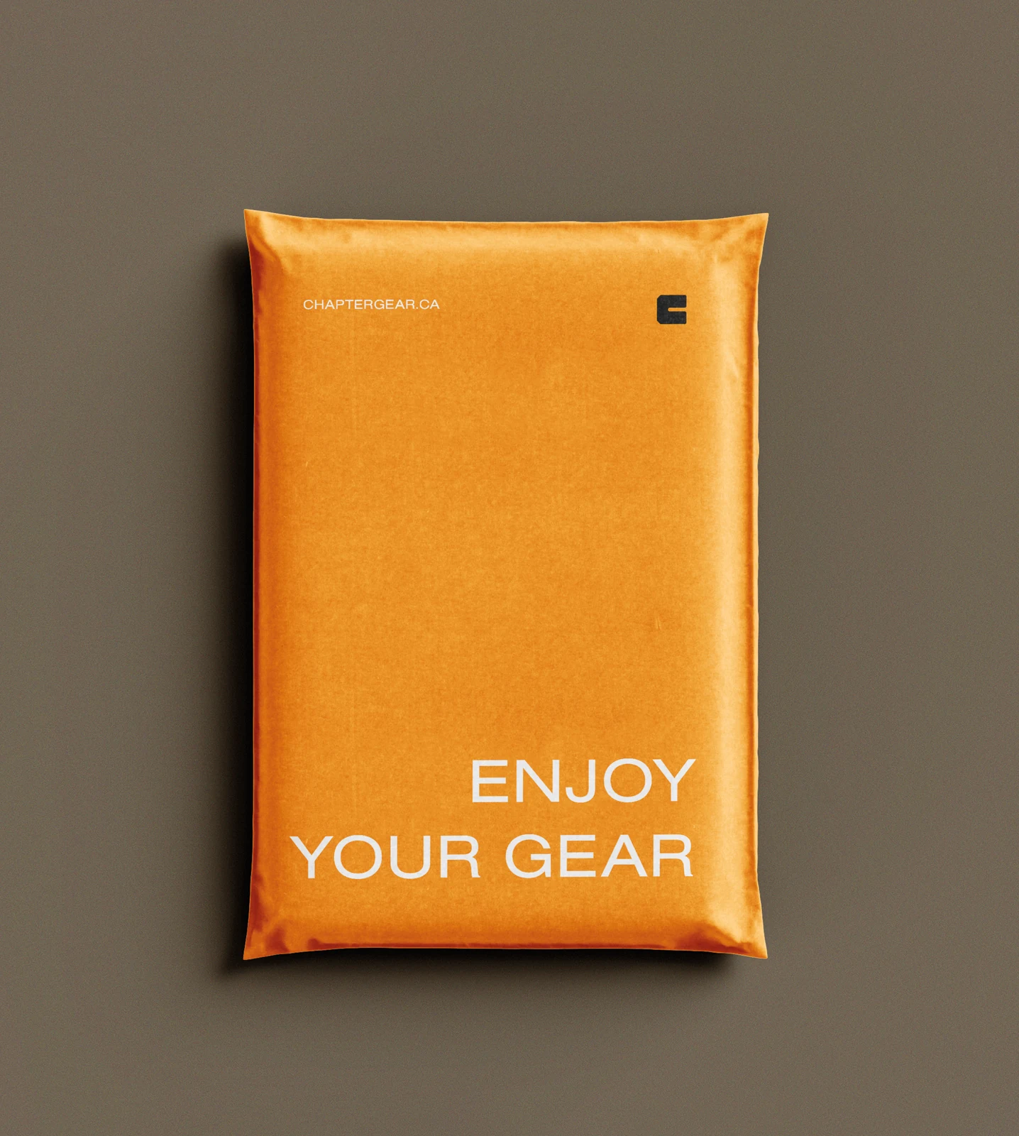
Four colours carry it — Rust Fall, Flat Dirt, Flat Dust, Flat Blue — with Nimbus Sans for running text. The system scales from a business card to a shipping container without ever changing its tone.
Special thanks to:
Shall we talk about your project?

Alex Poirier
Creative director